Virtual Lab
A virtual lab simulation for students.
Grand Canyon Education • 2022

Project Overview
Role
Web Design
Team
1 design manager, 1 project analyst, 2 web designers, 2 developers, 2 videographers
Tools
Adobe XD, Adobe Illustrator, Adobe Photoshop, After Effects, Bodymovin, Lottie Animation
Challenge
The GCU Master of Forensic Science program is new and is still growing. There have been requests to make it as hands on as possible to stand out from other similar programs on the market.
Solution
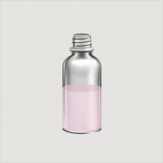
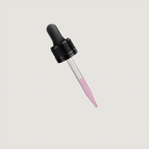
Build a new interactive simulation for one of the classes in the program. The simulation would create an interactive option for students to learn and conduct presumptive drug testing.
 rotate(-45 7 7)" width="14px"><path d="M 0 0.068 L 12.725 0" fill="transparent" height="1px" id="nWTC0FqqR" stroke-dasharray="" stroke-linecap="round" stroke-linejoin="round" stroke-width="2" stroke="rgb(248, 246, 243)" transform="translate(0 6.932)" width="12.725033351867122px"/><path d="M 0 0 L 7 7 L 0 14" fill="transparent" height="13.999959999999998px" id="f9BjJxgMG" stroke-dasharray="" stroke-linecap="round" stroke-linejoin="round" stroke-width="2" stroke="rgb(248, 246, 243)" transform="translate(7 0)" width="7px"/></g></svg>)
Project Background
I was working as a web designer for a small department called Academic Web Services (AWS) under a much larger company, Grand Canyon Education (GCE). Much of our work was to support Grand Canyon University’s (GCU) course curriculum.
About a year prior to this project kickoff, virtual lab research had been done to prepare for simulations like this, experimenting with tools like Lottie files to build out interactive components. Because of this, much of the mockup work and framework for the development phase was completed, which significantly reduced the scope of this project.
The Colorimetric Testing of Toxicants Virtual Lab was going to be our department’s first time taking this research and applying it to something real. The comps were handed off to me with the idea of creating this interactive lab for students in the new Master of Forensic Science program. With COVID-19 still on the rise, this would give students the ability to learn and conduct presumptive drug testing virtually and to complete an assignment that would be submitted and graded online.
As the primary web designer on the project, I was responsible for defining the overall experience. I would be shaping how the lab would look and function while working within the tools and resources available. Features like Lottie animations introduced additional complexity, requiring ongoing collaboration with development to test and refine the experience.
Success Criteria:
Students are able to test multipe of the 10 different drugs against 10 different reagentsi
Students are able to choose the drug to test and the reagent to use at random
Students are able to see reactions between each drug and each reagent individually
The activity allows the student to feel like the simulation is as real as possible
The activity by the student is tracked and provided at the end of the simulation as a PDF
This virtual activity can be tied in with the standard operating producedures and check for understanding