Oxygen Wellness & Physical Therapy

Website redesign for a physical therapy clinic.

Freelance • 2025

Project Overview
Role

UX/UI Design

Client

Dr. Clint Borman

Tools

Figma, FigJam, Zeplin, iMovie, ChatGPT

Challenge

The Oxygen Wellness website is struggling to convert visitors into leads and lacks meaningful user engagement.

Solution

Conduct a UX audit and redesign the website to improve usability, lead generation, and service-specific engagement.

Before
After
Project Background

Dr. Clint Borman, a physical therapist I had been seeing for the past three years, had recently started his own clinic, Oxygen Wellness & Physical Therapy. As he began building his client base, he was struggling to generate leads through his existing website.

An initial review revealed several key issues impacting performance, including a lack of clear calls to action, no dedicated lead capture opportunities, slow load times due to large assets, weak SEO, and repetitive, generic content across service pages.

Clint reached out to me for UX support. As both a client and a designer, I was especially excited to take on this project and to create a website that better reflected the quality of care and mission behind the clinic.

Before beginning, I established a structured approach to guide the work, breaking the project into five phases:

  1. UX Audit

  2. Content Audit

  3. Low-Fidelity Mockups

  4. High-Fidelity Mockups & Prototype

  5. Developer Handoff

Chapter I

Research

UX Audit

Before making any design changes, I took time to fully understand what already existed. This meant reviewing the current site, identifying what was working, what wasn’t, and why it had been set up that way.

I also focused on gaining a clear understanding of the business, its services, and any technical or operational constraints. It would have been easy to jump straight into making the site look better, but the goal was to ensure that every design decision had a clear purpose.


Homepage Breakdown & User Flow

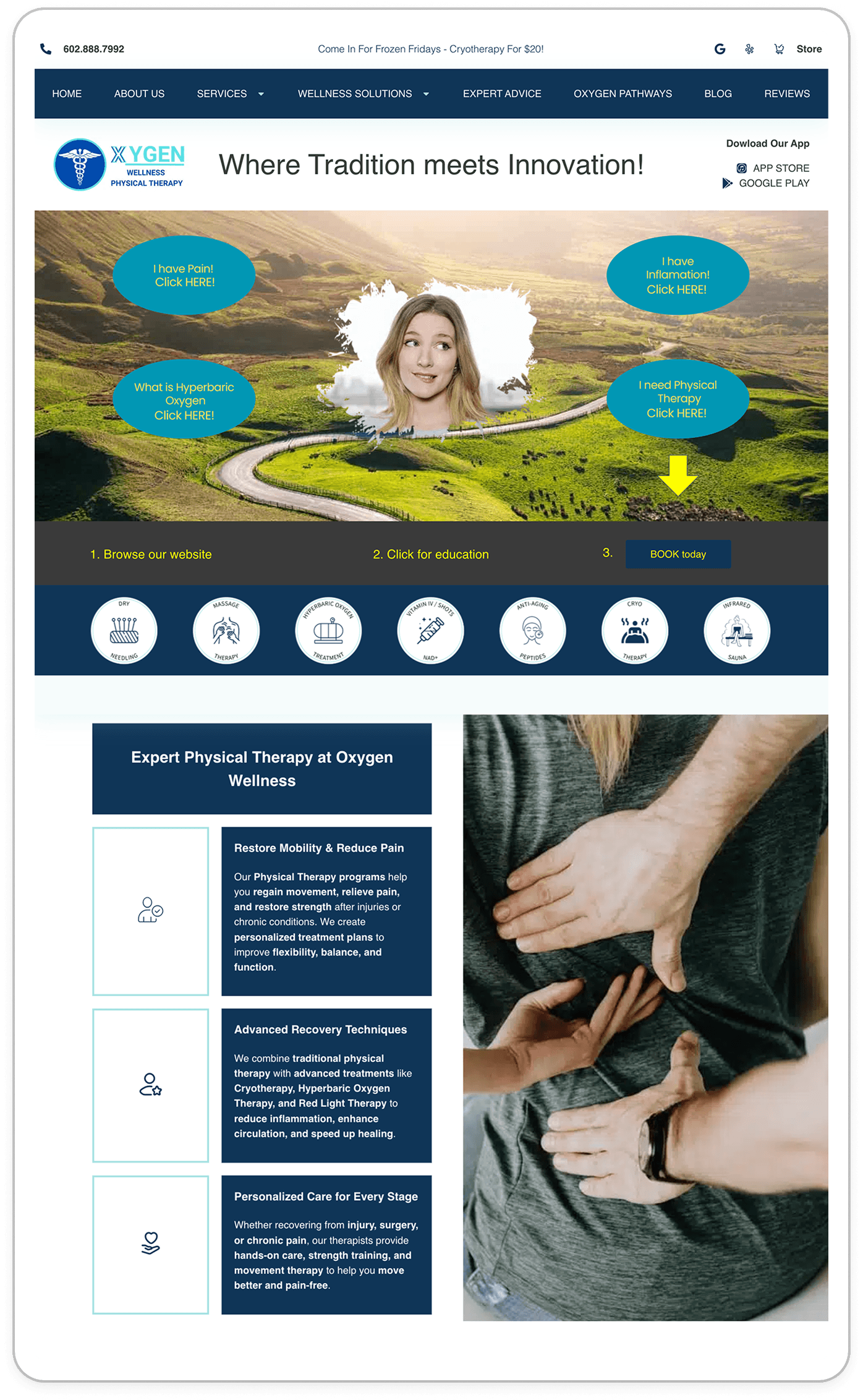
I started by closely reviewing the existing homepage, annotating key areas to identify what was and wasn’t working. While it was clear the experience had issues at a glance, I wanted to go deeper and document why those issues existed.

At the same time, I made an effort to understand Clint’s original vision for the site — what he was trying to communicate. Rather than replacing his ideas entirely, my goal was to refine and elevate them.

Since the homepage acts as the main entry point to the rest of the site, I also mapped out a user flow to understand how users were being guided through content and services. This helped evaluate whether the structure was prioritizing the right paths for potential clients and prospects, and later served as a reference when comparing the before and after experience. It also surfaced smaller details, raised questions about the business, and highlighted opportunities for improvement early on.


Sitemap & Information Architecture

After reviewing the homepage, I mapped out the full site structure to better understand how all pages connected and how content was organized. This helped identify opportunities to simplify the experience — highlighting redundant pages, gaps in content, and areas where the structure could be improved. While exploring potential changes, I also considered SEO impact to ensure valuable content wasn’t lost.

Creating a sitemap made it easier for both myself and the client to view the website as a whole and make more informed decisions about what should stay, be refined, or be removed.


Accessability Issues

As part of the audit, I made sure to evaluate not just visual issues, but overall accessibility and usability.


Key findings included:

  • Links did not clearly communicate their destination

  • Navigation structure was overly complex and difficult to move through

  • Interactive elements were inconsistent, making it unclear what was clickable (no defined design system)

  • Use of vague language such as “click here”

  • Missing or ineffective alt text on images

  • Color contrast generally passed, with the exception of yellow on teal


📝 Recap

After compiling notes and annotations, I created a concise summary of key findings and shared it with the client for feedback directly in FigJam. This collaborative review helped validate observations, clarify open questions, and align on priorities moving forward.

Key takeaways included:

  • Excessive and repetitive content across multiple pages

  • Too many competing CTAs on the homepage

  • Messaging that was often unclear or difficult to understand

  • Lack of clarity around what the site offers at first glance

  • High-resolution imagery impacting load time without adding meaningful value

  • Inconsistent visual design and lack of established UI patterns

  • Global components (FAQ, Newsletter, Social) contributing to content overload across pages

Content Audit

Recommended Site Map

As part of the content audit, I created a refined version of the existing sitemap to clarify scope and better communicate updates to the client. Before moving into low-fidelity wireframes, this helped prioritize key pages and simplify the overall structure.

My goal was to create flexible, reusable templates, making the redesign more efficient for development and ensuring a cohesive, scalable experience. This would also make the site easier to maintain over time, even without ongoing design support.

Accessabilty & SEO

Me and another designer collaborated together on identifying any pain points related to accessability, SEO, and overall organization of content. While accesssability was a big issue, SEO was in a good place (top keywords were being used throughout the site – even overly used). We both made note that if we are going to do a content refresh, we should make sure to still include SEO keywords.
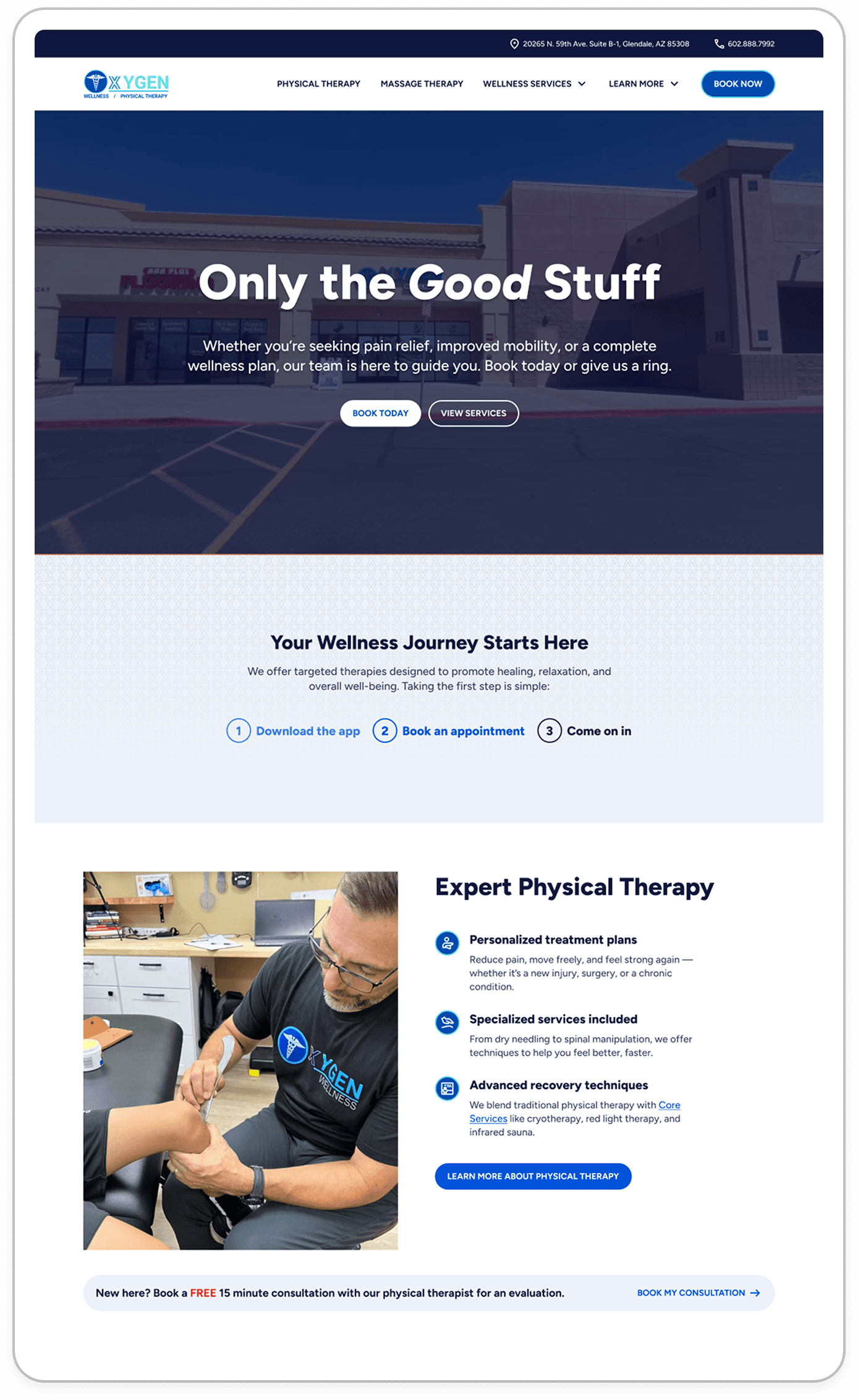

Photography

A BIG problem on this website was actually the photography. I knew this would be a driving force. As a client myself, I knew the first thing many people would wonder when coming across this website is: What does the place LOOK like? This includes services too. What are the vibes? What are people wearing? What does the physical therapist look like?

While this broadened the original scope, me and another designer decided to use our photography skills to use to take custom pictures and videos to represent the actual place. I felt the use of stock imagery wasn't really necessary and diminished the legitmacy of the place.

Competitor Research + Takeaways

Because the clinic offers a mix of physical therapy and wellness services, I reviewed a range of websites across both categories to better understand common patterns and expectations.

Some of my takeaways were:
  • Strong, authentic imagery is used to show what the therapy experience looks like and what users can expect

  • Overly complex or interactive visuals can introduce confusion—especially for an older demographic with specific health needs

  • Some sites emphasize transparency around pricing, helping build trust early on

Chapter II

Riff

Wireframes

When creating wireframes, I focused on key pages including the homepage, a wellness service page, and a reusable service template. This allowed me to establish a scalable structure that could be applied across the rest of the site.

Rather than designing every page at this stage, I prioritized defining layouts and patterns that could be reused, making the process more efficient moving into high-fidelity design.

I focused on desktop first, as it presented the most complexity and aligned with the primary user base. Mobile layouts were addressed later, primarily by adapting and stacking established patterns.

On-Site Photoshoot

While building out wireframes, I visited the location with another designer to capture custom photos and videos of the space, services, and overall experience.

Our goal was to show users exactly what to expect when walking into the clinic, creating a sense of familiarity, trust, and approachability. We focused on capturing the environment, interactions, and details that would help the space feel welcoming and authentic.

These visuals became a key part of the redesign, helping carry the overall experience and reinforcing the clinic’s brand in a way stock imagery could not.

Chapter III

Refine

Building a design system from scratch

As I moved into high-fidelity design, I built a design system from scratch, creating a library of reusable components and primitive tokens.

This included defining typography, color usage, spacing, and component patterns that could be applied across the site. While staying true to the existing brand, I refined how color and visual elements were used to improve clarity, hierarchy, and overall usability.

This system not only streamlined the design process, but also improved developer handoff by providing clear, consistent guidelines for implementation.

Hi-Fi Designs & Prototype

The final designs came together as a clean, structured, and cohesive experience. I intentionally avoided overcomplicating the design or forcing unnecessary “uniqueness.” Instead, I focused on creating something clear, approachable, and easy to navigate, while keeping development constraints in mind. The simpler the design, the more closely the final build would match the intended experience.

All key interactions were prototyped to clearly communicate behavior and flow, making expectations for development and handoff straightforward.

Handoff

For handoff, I focused on being as clear and thorough as possible, especially since all communication was handled asynchronously over email.

I organized all designs in Zeplin, ensuring pages were structured clearly and easy to navigate. Detailed annotations, additional views, and downloadable assets were included to communicate exactly how each screen should be implemented. I also provided a clear style guide covering typography, color, and component usage.

Because we weren’t collaborating in real time, I made an effort to build a strong working relationship through communication — providing context, clarity, and even a brief personal introduction to put a face to the work. This approach was informed by prior experience collaborating with engineers and adapting to real-world development workflows.

Overall, the process went smoothly and reinforced the importance of clear, thoughtful communication when working cross-functionally.

Chapter IV

Reflect

Results

Following the 10/18 launch, user engagement saw a substantial increase, climbing from a 15–55 range to a 60–100 range. Ongoing tracking is in place to further assess conversion performance and engagement across top pages.

Performance Improvements:
  • Improved load time by removing unnecessary assets and reducing the size of imagery

  • Fewer layout shifts and faster content rendering

  • Cleaner, more maintainable front-end structure for future edits

What I Learned
  1. AI can drastically improve effeciency. AI can make a real difference in day-to-day work, and this was the first project where I fully leaned into it. I used ChatGPT throughout the process to help with things like content restructuring, writing documentation, and speeding up more tedious tasks. It didn’t replace my thinking, but it helped me move faster and stay focused on the bigger picture.

  2. Knowing the business from a client perspective strengthens the work. Being a client of the business gave me a deeper understanding of the user experience. I already knew what users would want to see online, as well as how the physical space looked and functioned. This made it easier to design with both the business and the user in mind, reinforcing the importance of truly understanding what you’re designing for.

©

2026

Elizabeth Ardelt