Grid & List

Changing the way a customer browses vehicles on DriveTime.com.

DriveTime • 2023

Project Overview
Role

UX/UI Design

Team

1 UX manager, 1 product analyst, 1 UX designer

Tools

Adobe XD, Miro, Zeplin, FullStory

Challenge

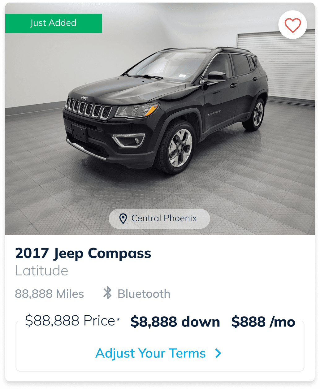
With the way the current Vehicle Search Results (VSR) page looks on mobile, customers can see just 1-2 cars at a time in their viewport. Observing customer behavior in FullStory, it is apparent that customers are scrolling quickly through VSR so they can see a lot of cars in a short amount of time.

Solution

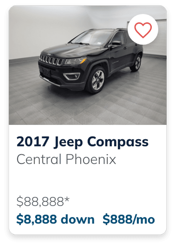
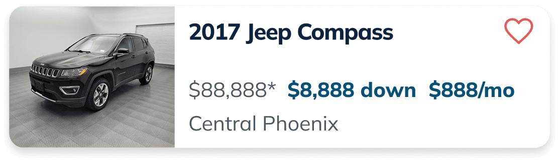
Create a new compact view that shows multiple cars in the viewport on VSR with minimal information.

Control
Grid
List
Project Background

An observation from reviewing FullStory sessions revealed that users were quickly scrolling through the Vehicle Search Results (VSR) page, suggesting they were trying to view more options in less time. Since down payment is a key factor for many customers, this raised the concern that users may not have been seeing financially relevant options, even when they were available.

On mobile, each vehicle card occupied a large amount of space, limiting how many options could be viewed at once. Based on this, a request was made to explore a more compact version of the card.

Our hypothesis:

By showing customers more cars with terms at a time, we would increase the likelihood that customers will find cars <$1,500 down and click into a Vehicle Details Page (VDP). This could increase our lead to sale numbers and the amount of VDP views that are occurring on mobile.

As the UX designer on this project, my goal was to create a more compact version of the mobile vehicle card while ensuring the VSR view still displayed the most important information.

Chapter I

Research

What do our customers care most about?

The biggest priority in this feature was deciding what information was essential on the vehicle cards and what could be removed. I knew as I would be changing the formatting of these cards to be more compact, some details would have to go to prevent confusion and visual clutter.

While providing more information can be helpful, too much at once can overwhelm users and make it harder to quickly compare options.

User Surveys

To get a better sense of how people were experiencing our current VSR page, I pulled together a quick research effort with a few designers and project analysts. We had friends and family navigate the experience while screen recording, then followed up with a short set of interview questions.

A consistent theme we saw was that the experience felt overwhelming, especially with the amount of content and infinite scrolling of vehicles. This helped validate the need for a more compact view.

It was also a good reminder that as designers, we sometimes overlook the fact that the people closest to us can be some of the most valuable (and accessible) test subjects.

Visual Research

I spent some time researching the way other applications display Grid List toggle functionality. I felt that this feature could be an opportunity to give customers a personalized experience where not only do they have their custom terms provided to them, but now they can also choose how they want to view those results rather than being forced into a view that isn’t working for them.

In my research, I identified some of the ways applications might indicate visually that there is a toggle. I believe a lot of times a personalized feature like this can easily be overlooked, so if this is something we were to include on the site, we should make sure it isn’t hiding as that could jeopardize the whole experiment. Gathering other examples helped me to brainstorm some of the ways we could redesign our filter/sort by header.

Researching other examples of Grid/List toggles also helped me to observe how content below was displayed. I was able to identify how these applications decided to reformat information while keeping the hierarchy of certain data consistent.

Chapter II

Riff

Hi-Fi Iterations

Because this feature updated an element already in production, starting with wireframes wasn’t the most efficient approach. Instead, I iterated directly in high-fidelity using existing components, keeping the hierarchy as close to the original card as possible. When presenting the work, I clearly outlined what content was included and what was removed. This made it easier for leadership to compare iterations and evaluate the tradeoffs.

The cards went through multiple rounds of leadership review, as key decisions needed to be made around content prioritization and banner logic (such as how frequently banners should appear within the results).

Although a view toggle was initially considered in the creative brief, it was ultimately deprioritized for MVP. I advocated for its inclusion, as it would allow users to switch views and reduce the risk of removing information from the Grid/List layouts if they weren’t the default experience.

Chapter III

Refine

Hi-Fi Comps & Handoff 

In the high-fidelity comps, we landed on two primary variations, with traffic split evenly across Control, Grid, and List views. The winning variant would become the default experience for the post-approval VSR.


What elements did we remove?

The vehicle trim, vehicle tags (with the exception of reserved vehicles), and CTA were removed from both views.

  • Vehicle trim: Added unnecessary length to the compact layout and wasn’t a top priority for users during initial browsing

  • Vehicle tags: Took up too much space on smaller images and weren’t feasible to include in the list view

  • CTA: Heatmap data showed users were already interacting with other areas of the card, making the CTA redundant

These changes helped simplify the layout while maintaining key interactions and reducing visual clutter.

Banner Placement

Banner placement closely followed the existing production experience. Rather than focusing on the number of cards between banners, I based spacing on visual real estate — matching how much space a banner occupies relative to cards in the current layout. This helped determine a consistent and balanced placement across the new designs.

Dev Handoff

A number of alternate views were required, as a large portion of the VSR page was changing. I created comps for larger mobile screens as well as loading states using skeleton views.

Some of these scenarios were initially missed in handoff, which reinforced the importance of anticipating developer questions and edge cases ahead of time. These details are just as critical as the core visuals.

Chapter IV

Reflect

Experiment Results 🧪

When first launching this experiment, the traffic was divided between Control, Grid, and List. After about two months, Grid was outperforming Control (an increase of 1.4% LTS) with List just slightly underperforming (a decrease of -0.7% LTS). For the next three months, traffic was split 50/50 between Grid and List to gather more data around these two views.

In a 14-day static pool comparison, List was performing better than Grid on a lead-sale basis.

The decision was made to direct all traffic to the List variation. List was the winner. 🎉

Next Steps

The toggle did not hit MVP during this iteration of Grid/List. Eventually implementing a version of this where customers can toggle between views could give customers a more personalized experience when shopping vehicles.

Because it was driving up conversion, we decided to also run a version of this for the pre-approval experience of VSR. Just like post-approval, we would be splitting traffic 50/50 to see which view outperforms the other. This decision was made because the two experiences were almost at a tie for post-approval.

For this new experiment, I was in charge of putting those mockups together and changing the styling of the cards slightly to accommodate the “Unlock Your Terms” CTA.

What I Learned
  1. Tap targets are important. Sometimes elements are smaller than the size of their tap target. Since these new card designs are so compact, I had to make sure the heart icons had enough space around them — even if that space is invisible. Before this feature, this was not something I was quite as aware of.

  2. In the end, it’s about the business. In this feature I strongly advocated for having a toggle, giving the users the ability to switch between views. The toggle did not hit MVP during this round and it was later decided that we pick one view or the other. While I think a toggle would’ve been fun to have — especially to emphasize our that we give our users a personalized experience, the ultimate goal was that we increase our lead to sale numbers, so it was a reminder for myself that the business comes first.

  3. A bad iteration can lead to the right solution. Sometimes it’s necessary to create the version you know is going to look bad because it actually ends up sparking another idea that otherwise wouldn’t have been thought of. This was a feature where the final look for pre-approval was born out of a variation that I knew wouldn’t work.

©

2026

Elizabeth Ardelt