Homepage Optimization
Turning a failing homepage direction into a successful launch through strategic UX decisions and user validation.
Progress Residential • 2025

Overview
Role
UX/UI Design
Team
1 product manager, 1 UX designer, 1 copywriter
Tools
Figma, Maze
Challenge
A redesigned homepage was introduced as part of an A/B test aimed at improving trust, simplifying home discovery, and increasing funnel conversion. However, early test results showed the original homepage was outperforming the new experience.
Solution
Identify friction points in the redesigned homepage to help the new experience outperform the original in a re-launch.
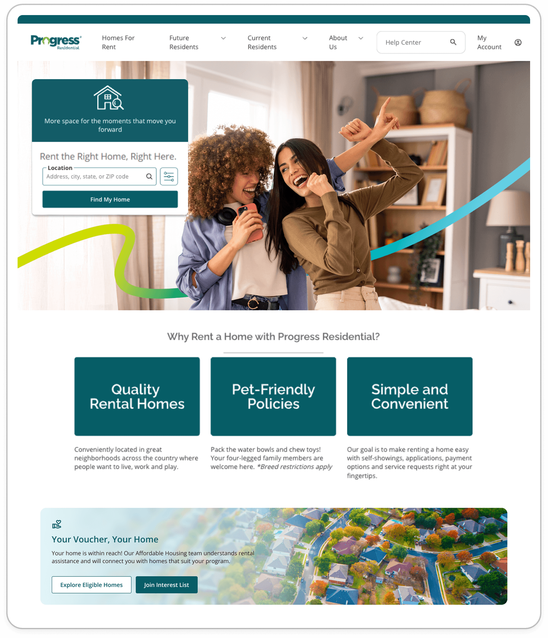
Control
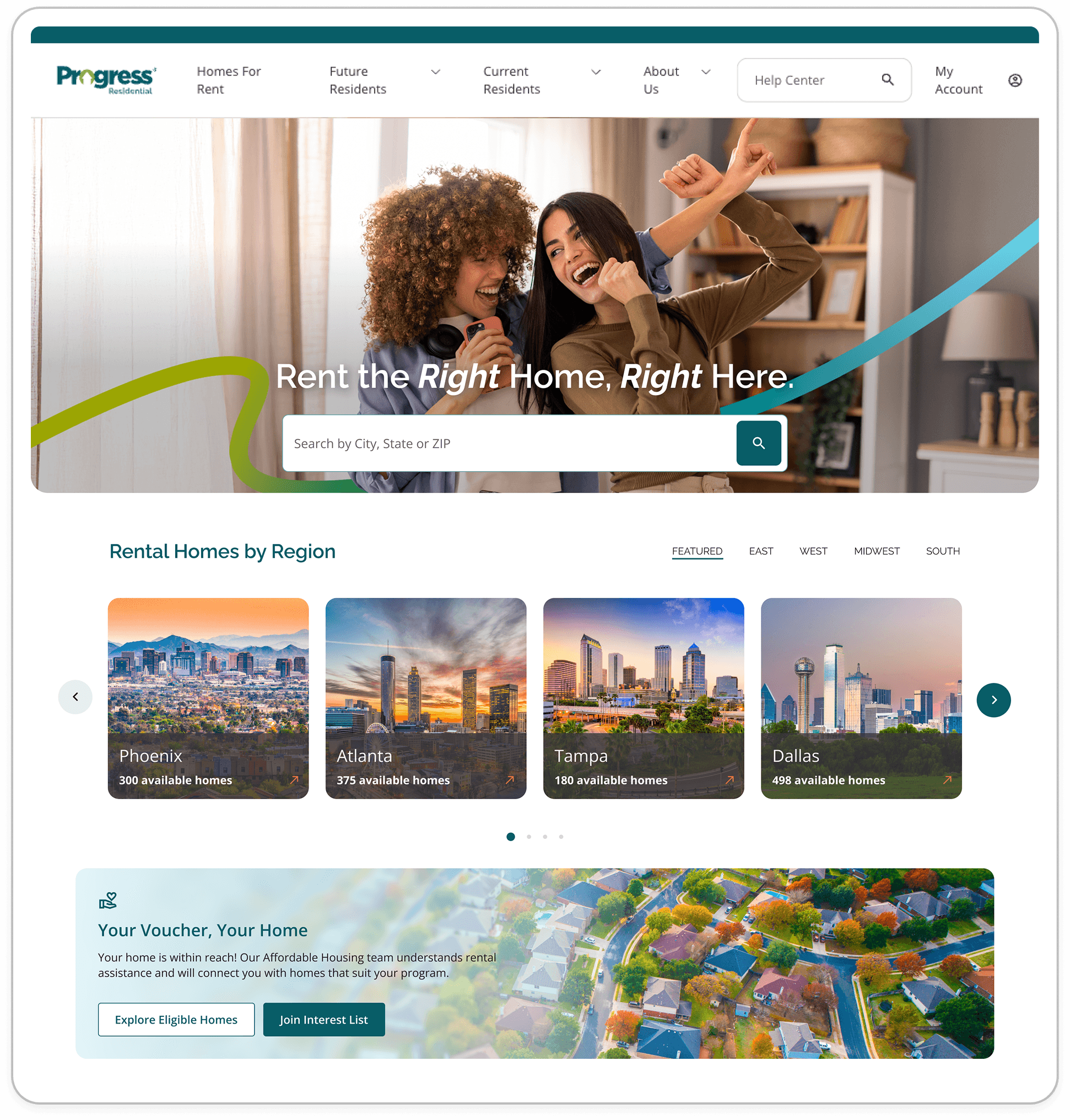
Treatment
Project Background
Shortly after joining Progress Residential, I inherited a homepage redesign experiment that had already launched prior to my arrival. The redesign was intended to simplify search, build trust, and improve conversion, but early A/B test results showed the original homepage was consistently outperforming the new experience.
Rather than retiring the new experience entirely, Product wanted to understand why it underperformed and determine whether it was worth iterating on. As the new designer on the team, I was tasked with evaluating friction points in the redesign and identifying quick, high-impact improvements that could give the homepage a second chance.
Original Hypothesis:
We anticipated that users in the treatment group would demonstrate higher conversion rates than the ‘control’ group, driven by a simplified search experience, the addition of market carousels, enhanced business credibility, and a refreshed modern UX design.
Results:
Contrary to our hypothesis, the ‘control’ group consistently outperformed the treatment group in conversion rates. The results have reached statistical significance, indicating that the current redesign does not improve performance relative to the original experience. We need to iterate on the experiment and re-launch with a new approach.


 rotate(-45 7 7)" width="14px"><path d="M 0 0.068 L 12.725 0" fill="transparent" height="1px" id="nWTC0FqqR" stroke-dasharray="" stroke-linecap="round" stroke-linejoin="round" stroke-width="2" stroke="rgb(248, 246, 243)" transform="translate(0 6.932)" width="12.725033351867122px"/><path d="M 0 0 L 7 7 L 0 14" fill="transparent" height="13.999959999999998px" id="f9BjJxgMG" stroke-dasharray="" stroke-linecap="round" stroke-linejoin="round" stroke-width="2" stroke="rgb(248, 246, 243)" transform="translate(7 0)" width="7px"/></g></svg>)


