App Cert Enhancements
Redesigning the App Cert experience on DriveTime.com so a customer can see their personalized terms on every car.
DriveTime • 2022

Project Overview
Role
UX/UI Design
Team
1 UX manager, 1 product analyst, 1 UX designer, 1 content specialist, 1 graphic designer
Tools
Adobe XD, Adobe Illustrator, Miro, Zeplin
Challenge
The Approval Certificate (App Cert) page is not consistent with the direction the Vehicle Search Results (VSR) page has taken, which is to display terms on every vehicle. This has created a gap in the customer’s online shopping experience.
Solution
Redesign above the fold of the App Cert page to display a selection of cars with the user’s personalized terms.
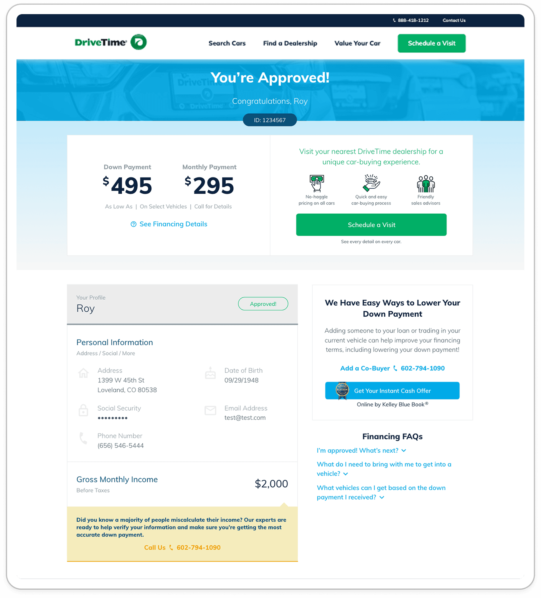
Before
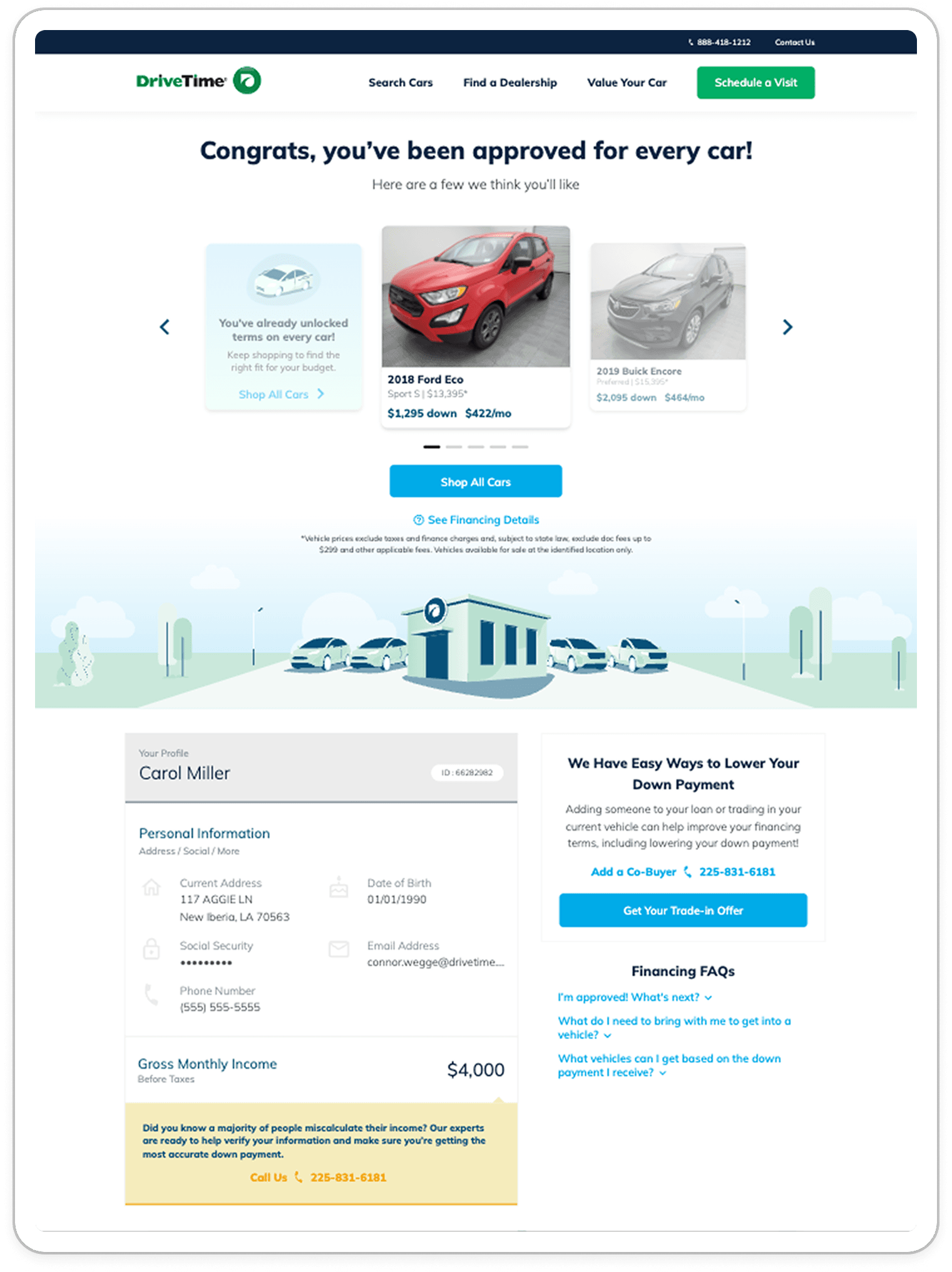
After
Project Background
When I joined the DriveTime creative team, a major update had recently been introduced: adding personalized terms to the Vehicle Search Results (VSR) page. This “HyperDrive” experience allowed users to see their terms on every vehicle they browsed, moving the company closer to a fully online shopping and purchasing experience.
To access these terms, users first complete the Get Approved (GA) process. If approved, they land on the Approval Certificate (App Cert) page, where they are shown starting terms based on the lowest-priced vehicle available to them. At the time, these terms were presented as standalone numbers, without any vehicle context.
I was assigned the App Cert Enhancements project, with the goal of reimagining the experience to better align with the current design system and the HyperDrive experience on VSR. The objective was to create a more cohesive and engaging experience that encouraged users to continue shopping, ultimately increasing lead-to-application conversion.


 rotate(-45 7 7)" width="14px"><path d="M 0 0.068 L 12.725 0" fill="transparent" height="1px" id="nWTC0FqqR" stroke-dasharray="" stroke-linecap="round" stroke-linejoin="round" stroke-width="2" stroke="rgb(248, 246, 243)" transform="translate(0 6.932)" width="12.725033351867122px"/><path d="M 0 0 L 7 7 L 0 14" fill="transparent" height="13.999959999999998px" id="f9BjJxgMG" stroke-dasharray="" stroke-linecap="round" stroke-linejoin="round" stroke-width="2" stroke="rgb(248, 246, 243)" transform="translate(7 0)" width="7px"/></g></svg>)


